
“Prepare to be enthralled by the art and psychology of UX design. Colours shape your digital journey, silently telling stories that change your perception of the digital world.”
Introducing you to the vibrant world of UX design, where colours aren’t just pixels on a screen but the emotional architects of your digital journey. Imagine your favourite website – what if I told you that every shade, every hue was meticulously chosen to make you feel, think, and act in a certain way? Welcome to the captivating fusion of art and psychology in “Emotional Colour Impact in UX Design.” This post reveals how colours can be your silent storyteller, shaping your digital experience like never before. So, fasten your seatbelts. We’re about to embark on a colourful excursion that will change how you perceive the digital landscape.
Science of colour Psychology
“Integrating colour psychology into UX design influences user perceptions and improves digital experiences, leaving a lasting impact.”
Before we explore how colour psychology is applied in UX design, let’s first examine its fascinating science. Colour psychology delves into the intricate relationship between colours and human emotions, thoughts, and behaviours. While personal and cultural experiences can certainly influence our individual responses to colours, there are some universal associations that designers can tap into. These associations are crucial tools in our creative armoury because they help us to engage with users on a deeper, more emotional level.
Here are a few realistic examples
- Red: Frequently associated with passion, excitement, and urgency, and it has the ability to capture attention and stimulate action.
- Blue: Known for its calming and trustworthy qualities, blue is constantly used in designs that aim to convey reliability and professionalism.
- Yellow: Because it is cheerful and energetic, making it suitable for designs targeting happiness, optimism, and positivity.
- Green: Associated with growth, health, and nature, green can be used to promote balance and harmony.
- Purple: Often linked to luxury, creativity, and spirituality, purple can add a touch of sophistication to your designs.
- Orange: Energetic and friendly, orange is often used to convey enthusiasm and playfulness.
- Black: Symbolizing power and sophistication, black can be used to create a sense of luxury and timelessness.
- White: Signifying purity and simplicity, white can create a feeling of cleanliness and space.
Now that we understand the basic emotional associations of colors, let’s explore how to leverage this knowledge in UX design.
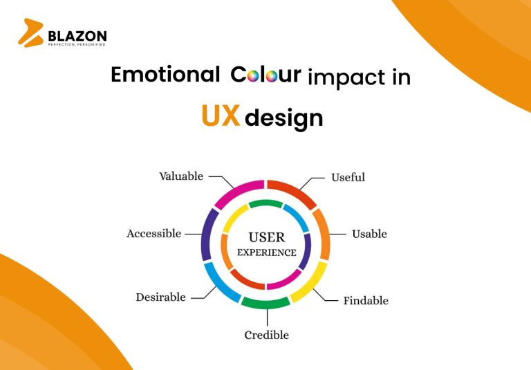
The Impact of Colour in UX Design
“Colour has an impact on brand identity, readability, attention, emotion, trust, and user reactions.”
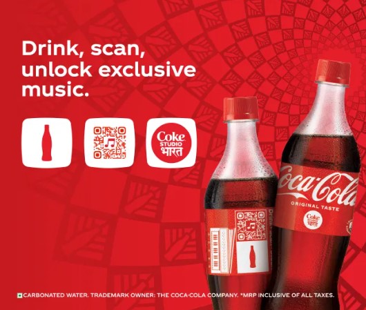
1. Establishing Brand Identity:
Example: Coca-Cola
- Coca-Cola’s iconic red logo promptly evokes feelings of excitement and enjoyment. It has become synonymous with the brand’s identity and is constantly used in their marketing materials.
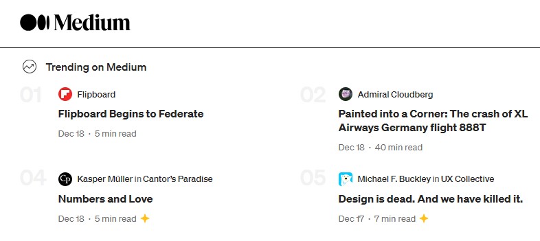
2. Enhancing Readability and Legibility:
Example: Medium
- Medium uses a combination of a white background and black text for its articles. This high-contrast colour scheme ensures excellent readability, making it easier for users to consume content.
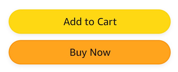
3. Guiding User Attention:
Example: Amazon
- Amazon’s “Add to Cart” and “Buy Now” buttons are vibrant orange, making them stand out prominently on product pages. This colour choice guides users attention and encourages them to take action.
4. Conveying Emotional Tone:
Example: Spotify
- Spotify uses shades of green and black to create a calming and immersive user experience. These colours align with the platform’s goal of providing a relaxing environment for music enthusiasts.

5. Building Trust and Credibility:
Example: PayPal
- PayPal’s predominantly blue interface helps instil trust in users, especially when handling financial transactions. Blue is associated with reliability and security, enhancing the platform’s credibility.

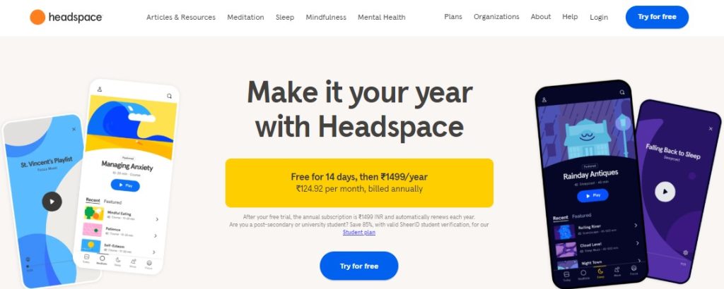
6. Evoking Emotional Responses:
Example: Headspace
- The Headspace meditation app uses a soothing combination of blues and purples to create a calming, stress-relieving atmosphere. These colours evoke the desired emotional response from users.
Simplify UX with Smart Colours
“Smart colour choices improve UX.” Research, accessibility, testing, cultural sensitivity, and balance all lead to great design.”
Now that we’ve explored the emotional impact of colour and seen real-world examples, here are some practical tips and tricks to help you harness the power of colour in your UX design:
1. Conduct User Research:
- Before choosing colours, conduct user research to understand your target audience’s preferences and emotional responses to different colours. This may require conducting surveys, interviews or user testing.
2. Create a Comprehensive Colour Palette:
- Develop a cohesive colour palette that includes primary, secondary, and accent colours. This will maintain visual consistency throughout your design and ensure a harmonious colour scheme.
3. Test for Accessibility:
- Make certain that your colour choices are usable by all users, especially those with visual impairments. Use tools like colour contrast checkers to verify accessibility compliance and adhere to Web Content Accessibility Guidelines (WCAG).
4. Implement A/B Testing:
- A/B testing allows you to evaluate the effectiveness of colour choices. Test different colour variations of elements like buttons, headlines, or background colour to determine which resonates best with users and drives desired actions.
5. Consider Cultural Differences:
- Be mindful of cultural associations with colours, as they can vary significantly. Colours may have different meanings in various cultures, so research your target audience’s cultural context to avoid misunderstandings.
6. Balance Emotion and Functionality:
- Strive for a balance between the emotional impact of colours and the functionality of your design. While colours can evoke emotions, ensure that your design serves its purpose effectively, whether it’s for e-commerce, information sharing, or entertainment.
7. Optimize for Different Devices:
- Keep in mind that colour perception can vary on different devices and screens. Test your design on various devices to ensure a consistent user experience across platforms, whether on a desktop monitor, tablet, or smartphone.
8. Leverage Colour Psychology Principles:
- Familiarize yourself with colour psychology principles to make informed colour choices. For instance, warm colours like red and orange can create a sense of urgency, while cool colours like blue and green can induce relaxation. Use these principles strategically to align with your UX goals.
9. Use Colour to Differentiate Elements:
- Employ colour to distinguish various elements within your interface. For instance, use a specific colour for primary buttons, another for secondary actions, and a different one for links. This helps users navigate your site or app more intuitively.
10. Stay Updated with Design Trends:
- Design trends and customer needs evolve over time. Keep an eye on the latest colour trends in UX design to ensure your interface remains fresh and relevant.
Final Thoughts
“Colour has tremendous power in UX design—it can shape emotions, thoughts, and behaviours. Strategic choices result in memorable, user-friendly experiences.”
In the world of UX design, colour is a powerful tool that can influence user emotions, thoughts, and behaviours. By understanding the psychology of colour and implementing it effectively, you can create memorable and user-friendly experiences. From establishing brand identity to guiding user attention and evoking emotional responses, colour plays a vital role in shaping the user experience.
Remember that colour choices should align with your brand’s identity and the emotional tone you wish to convey. Consider user research, accessibility, and cultural factors when selecting colours. By following these tips and tricks, you’ll be well-equipped to harness the emotional colour impact in your UX design and create interfaces that leave a lasting impression on users. Whether you’re designing a website, mobile app, or any digital product, colour is a powerful tool at your disposal—use it wisely to connect with your audience on a deeper level and deliver exceptional user experiences.